
Choosing the Right Neutral Paint
- Mar 15
- 6 min read
Updated: Mar 16
By Dagmar – stylist, lover of natural tones, grateful for the homes I create
Building a Calm Foundation for Your Home
Every beautiful interior begins with a basic foundation.
Before the textures, before the vintage finds, before the small objects that tell your story… there is color. Or perhaps better said: the absence of loud color (in my world that is).
I have always been drawn to natural, soft paint tones, specially when it comes to the core of my home such as walls and ceiling. The kind that feel as if they were borrowed from nature itself. Sand tones, warm whites, muted greys, soft clay colors.

These colors don’t dominate a space.
They hold it.
They create the calm base that allows a room to breathe and lets furniture, textures and meaningful objects quietly take their place.
Over the years I have collected a small library of neutral colors that I love to work with.
Colors that feel warm rather than cold, soft rather than stark. In this blog I’m sharing some of those paint colors and their numbers, so you can explore them in your own home.
Where This Blog Began
The idea for writing this blog actually started with my cousin Lonneke.
She and her family have been lovingly rebuilding their home over the past years. Not the quick kind of renovation, but the kind where every wall, every new outbuild and every decision carries effort, patience and care. The house has slowly grown into something truly beautiful, a place shaped by their own hands and filled with warmth and style.
Right now she is transforming the upstairs of an old garage into bedrooms for their teen-kids.
A wonderful project, full of promise and excitement.


But somewhere along the way she hit a moment that many of us recognize.
The practical work is moving forward, the walls are ready… and suddenly the question appears:
What color should it be?
She called me about it, standing right there in the middle of the space, surrounded by paint samples and possibilities.
Moments like that always touch me a little.
Not because I think I have all the answers, but because it means someone trusts the way I see color and space. That someone invites me to look along with them, to help them find the calm and balance they are searching for in their home.
And there is something deeply special about that. To be asked for guidance in a place that is so personal. A home that holds family life, laughter, growing children and everyday moments.
It reminds me again why I love working with interiors so much. Because choosing a color is never just about paint on a wall. It is about creating the atmosphere where life will unfold.
So this blog is also for Lonneke, and for anyone who finds themselves standing in front of a wall, holding a handful of color samples and wondering which direction to take.
Sometimes all it takes is a little guidance, a bit of patience, and the understanding that the right color is already quietly waiting to be discovered.

Always Test Your Colors
A paint color can look completely different once it is on your wall. That’s why I always recommend testing before committing to an entire room, and whoops .... ordering many liters of paint and not feel at ease with the final result, that is not your aim.
Paint a generous swatch directly on the wall you are planning to paint (you can order small test cans that provides just enough paint to do so). If possible, use the actual paint rather than a tiny sample card. A larger painted area will give you a much better understanding of the color.
Then simply live with it for a few days.
Look at it in the soft light of the morning. Notice how it changes in the afternoon. And observe it again when evening light gently fills the room. Light is constantly moving, and the color will move with it.
As an example: just look at the chair below and see what a difference light brings where the sun hits the fabric and where not. Light is key.


The Direction of the Room Matters
Every room has its own personality depending on the direction it faces.
For these examples I worked with the same three calm base colors and changed only one accent tone, so you can see how the direction of light in a room can influence the overall palette.
North-facing rooms
These rooms receive cooler light. Neutral colors with a warm undertone—soft beige, warm greige, or creamy whites—can bring balance and prevent the room from feeling too cold.

South-facing rooms
These spaces are blessed with warm sunlight throughout the day. Many neutrals work beautifully here, but slightly softer or muted tones can help keep the space calm and balanced

East-facing rooms
Morning light is gentle and warm. In these rooms, light neutrals feel fresh and uplifting, perfect for spaces where the day begins.

West-facing rooms
The afternoon light can be rich and golden. Slightly deeper neutrals or earthy tones often look beautiful here, as they catch that warm glow in a lovely way.

When you start noticing these subtle differences, choosing paint becomes less about guessing and more about working with the natural rhythm of the light in your home.
A little side note about the color 'Storm’s Coming'. I used and loved it in our previous home where the rooms were filled with light. And I definitely wanted to use it again. In my new apartment, however, the light told a slightly different story. So instead of a full Storm, I politely asked the paint mixer for half the recipe so a generous 50% extra white was added. And it worked perfectly.
And that’s exactly what I love to share with you: don’t be afraid to visit a good specialist paint shop and let them guide you. A knowledgeable paint mixer can help you adjust a color that you love, so it truly works in your home.
Let Colors Flow Through the Room
One styling approach I absolutely love is allowing colors to flow gently through a space. Instead of painting only the walls, consider using the same tone on door frames, doors, walls and even the ceiling. Yes it might be daunting but please give it a go, it will surprise you in a good way.
When done with calm, natural colors this creates a beautifully serene feeling.
The room suddenly feels softer.
More connected.
Almost like it wraps around you.
A quiet, zen-like space.
And if you are drawn to a darker palette, there is a simple trick I often use: stay within the same color family, but introduce a slightly lighter tone somewhere in the room. This lifts the space just enough without everything becoming too heavy or too dark.
It keeps the room calm, layered and balanced.


Finding Color in the World Around You
Many of the neutral tones I love didn’t come from a paint chart.
They came from the world around me.
Whenever we travel, I don’t just look at streets or old villages. I always look a little closer.
At the bed & breakfast we stay in, I’ll notice the linen on the bed, the throw that lies casually across it, or the bedside table with a small stack of books that someone thoughtfully placed there.
In a restaurant I might spot a couple of old weathered baskets tucked into a corner.
Or a small detail that most people would never notice.
These little scenes often hold the most beautiful combinations of color and texture. I collect them quietly with my camera and later bring them home in a different way.
That is how styles begin to blend in my mind.
Like these photos from the beach in France, a small town on the ocean side in Oregon and a sweet fishing village in Spain.
Individually they belong to different worlds but together they form a palette. And that palette slowly finds its way into the spaces I create at home or in a clients home.


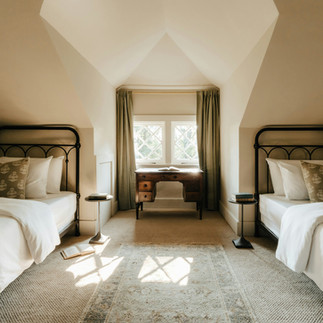
Styling a Room That Can Breathe
Once a calm neutral base is in place, something beautiful happens.
The room begins to breathe. Textures become more visible.
A wooden table, a linen curtain, an old ceramic bowl or a stack of magazines, each piece suddenly has space to exist. This is why I love styling in a minimal, thoughtful way.
Not empty, but intentional.
A room that breathes often feels warmer than one filled with too many objects.
The above tones create a base that allows textures, vintage pieces and natural materials to quietly tell their story. Because when the foundation of a room feels calm and natural, everything else slowly falls into place. And the house becomes a home, what we all long for most.
If somewhere along the way you find yourself hesitating between colors, wondering what might work best in your space, know that you’re always welcome to ask. I’m happy to look along with you.
With love,
Dagmar
Linen & Wood


